
Graph engineering is the term of the month. You have seen the diagrams on your feed: a question enters at the top, a planner splits it into five parallel researchers, a skeptic attacks the findings, a merger writes the recommendation, a checker grades it, a human approves it. The diamond shape is everywhere, and the pattern is genuinely good. Work designed as a graph beats work crammed into one chat window.
None of the diagrams show the part that lands on your invoice. Every arrow has a price tag.
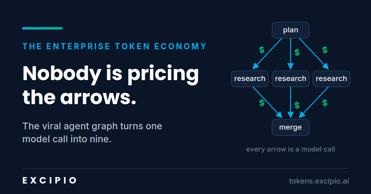
The chat version of “should I build this startup” is one model call. The graph version of the same question is a planner call, five researcher calls, a skeptic call, a merger call, and a checker call. That is nine calls before anything loops. Add one revision cycle, which every real workflow has, and you are at twelve to fifteen. The diagram that went viral because it produces better answers is also a diagram of your token bill multiplying by an order of magnitude.
Graphs are worth it. I would build them anyway, and I tell design partners the same. What bothers me is that the industry is teaching everyone the workflow pattern and nobody the unit economics.
The redundancy hiding inside the diamond
Look closely at what those nine calls actually contain. The planner reads the company context to decompose the question. Each of the five researchers reads overlapping slices of the same context to do their work. The skeptic re-reads what the researchers produced plus the context needed to attack it. The merger re-reads everything. The checker re-reads the merge.
The same enterprise knowledge, retrieved and paid for five, six, seven times inside a single run. Now multiply by the runs. A support triage graph does not run once. It runs on every ticket. A content graph runs on every piece. A code review graph runs on every pull request. Bounded, high repetition workloads are exactly where graphs get deployed first, because that is where the quality gain justifies the build.
Which means the pattern the market is adopting fastest is the pattern that inflates the rediscovery tax fastest. Your agents keep re-deriving what your organization already knows, and in a graph, they re-derive it at every node.
Two graphs, and only one of them is trending
The video essays make a distinction worth keeping. There are agent graphs, which govern how work moves: the boxes and arrows, the planners and checkers. And there are knowledge graphs, which govern what the work knows: the relationships in your data that reasoning runs across.
The content wave is almost entirely about agent graphs. That is understandable. Agent graphs are visible, drawable, and you can build one this afternoon in LangGraph or n8n. The knowledge layer underneath is invisible in the diagram, so it is invisible in the discourse.
But follow the arrows. Every node in an agent graph resolves its knowledge from somewhere. Today, for most teams, that somewhere is a frontier model API, at full price, at roughly 2,500 milliseconds per live call, with your context leaving the building every time. You are renting your own institutional knowledge back from a model provider, once per node, per run, forever.
That is the rent position. The own position looks different: repeated semantic queries resolve from a customer owned, compounding knowledge graph inside your perimeter, at sub-10ms on a hit, with zero bytes leaving the perimeter on a cache hit. The agent graph stays exactly as designed. The substrate underneath it changes, and the modeled result is roughly a 42% blended token cost reduction across the workload.
The agent graph decides how work moves. The knowledge graph decides what the work knows, and whether you rent it or own it.
The question nobody has measured
If you have agent graphs in production, or on the roadmap, there is one number worth knowing before the CFO asks for it: across the nodes in your graph, what percentage of retrieved context is the same enterprise knowledge, retrieved repeatedly?
Almost nobody measures this, because the diagrams do not have a column for it. But the arithmetic is not subtle. Parallel decomposition splits one retrieval into five overlapping ones.
The overlap is the tax.
The advice circulating in the graph engineering wave is correct as far as it goes: build the smallest graph that raises quality, and put the human gate where mistakes get expensive. I would add one line to it. Put the memory layer where the retrievals repeat, because that is where the money leaks.
The diagrams price nothing. Your invoice prices everything. Close that gap while it is still cheap to close.
The Enterprise Token Economy tracks the unit economics of enterprise AI. If your agent workloads are repetitive and your token bill is not shrinking, that gap is the subject of this newsletter.